— 01
Generic Branding
Cookie-cutter templates strip away the character that makes small bakeries worth visiting in the first place.
Artisan bakery crafted for modern comfort.
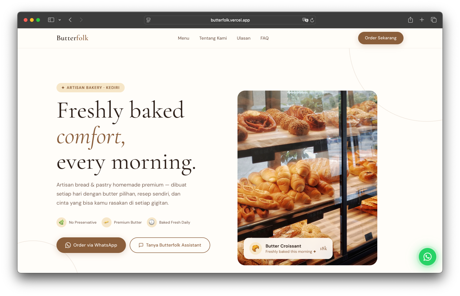
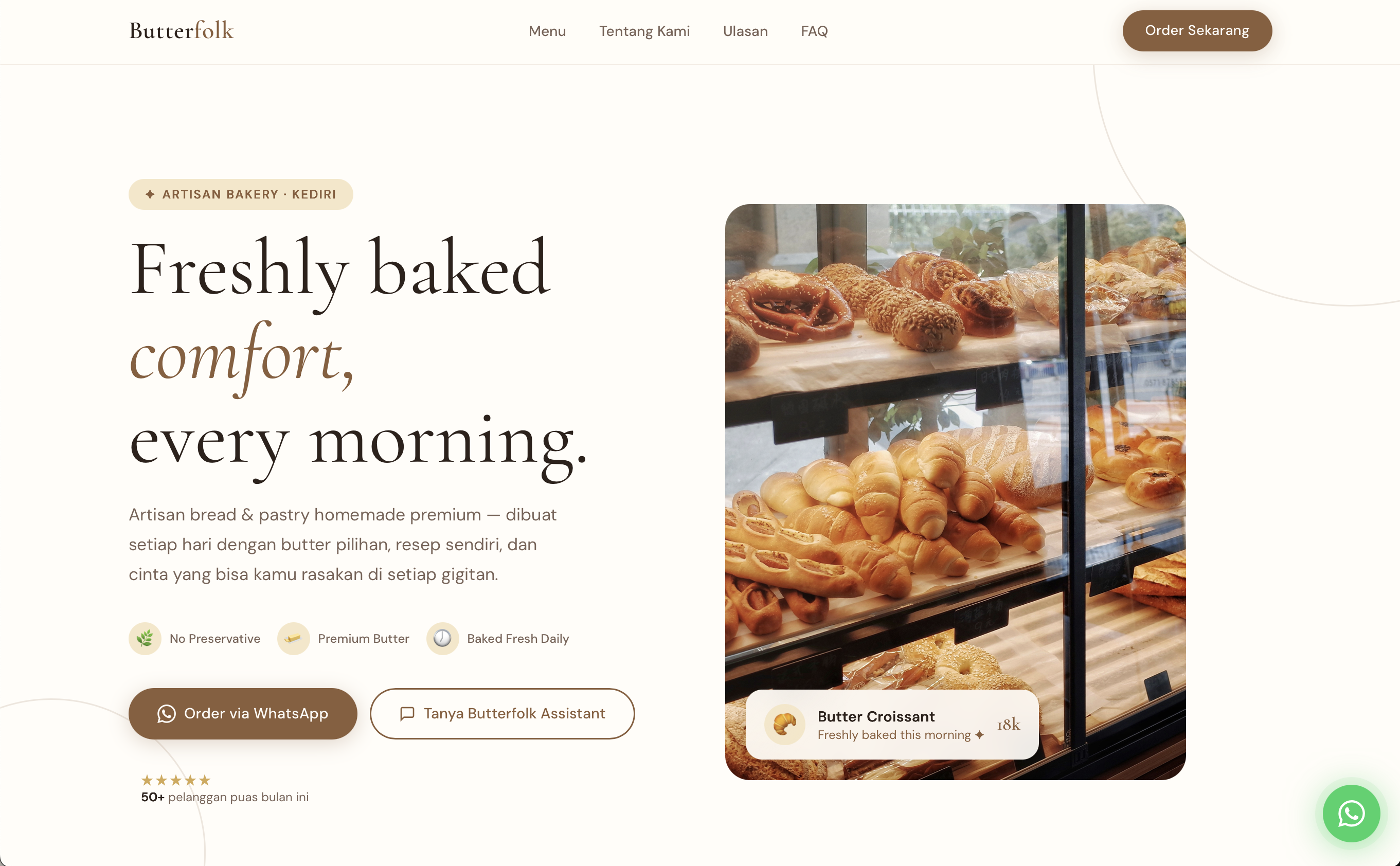
Butterfolk is a modern artisan bakery rooted in European baking traditions — sourdough that breathes, butter that melts, mornings that feel unhurried. The brief was deceptively simple: build a digital home that feels as honest and handcrafted as the bread itself.
The brand occupies a considered space between neighbourhood warmth and soft luxury. Every visual decision needed to reflect this duality — approachable, never precious; warm, never saccharine; minimal, never cold.
The result is a digital identity that earns trust the moment it loads. Slow, intentional, and unmistakably Butterfolk.
Brand Positioning
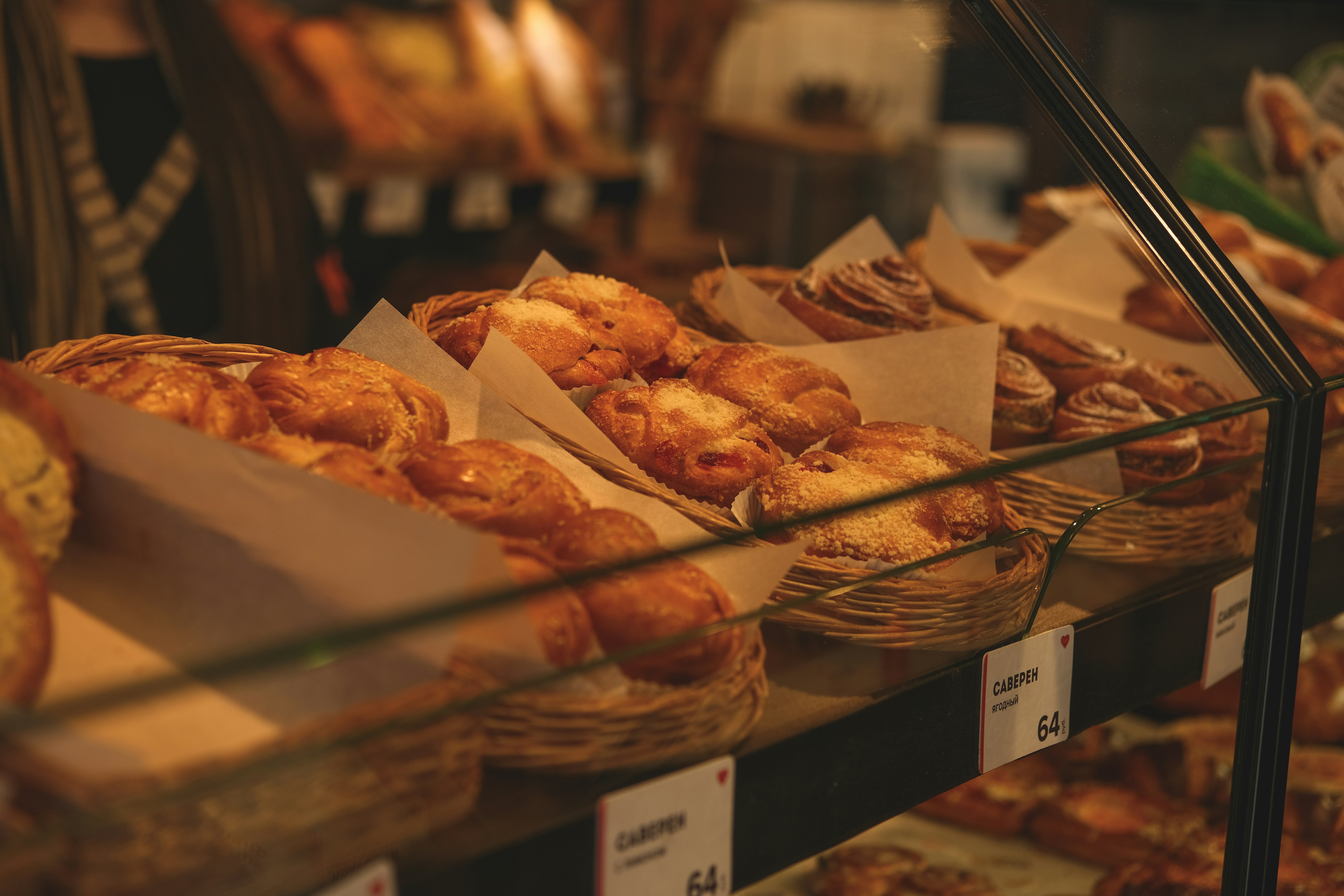
Butterfolk isn't a chain pretending to be artisan. It's a bakery that treats flour like a conversation — patient, tactile, deeply human. The brand needed to feel like stepping into morning light through a bakery window.
We positioned Butterfolk as calm premium: earthy textures, editorial restraint, and a voice that whispers rather than shouts. Cozy without clutter. Luxury without distance.
The Challenge
Most local bakeries exist online — but don't make you feel anything.
— 01
Cookie-cutter templates strip away the character that makes small bakeries worth visiting in the first place.
— 02
Mismatched fonts, colours, and photography erode the sense of craft before a single loaf is sold.
— 03
Most visitors arrive on mobile. A clunky experience translates directly to lost orders and damaged trust.
— 04
Without a defined voice and visual soul, local bakeries fail to build the loyalty that keeps customers returning.
Visual Direction
The visual language draws from aged paper, morning light, and handwritten menus. Earthy tones meet refined typography in a system that feels cultivated rather than designed.
Colour Palette
Display — Cormorant Garamond
Good bread
takes time.
Body copy in DM Sans — clean, legible, quietly confident at every size.
Type Weights
Every loaf tells a story.
Typography as brand voice — Butterfolk
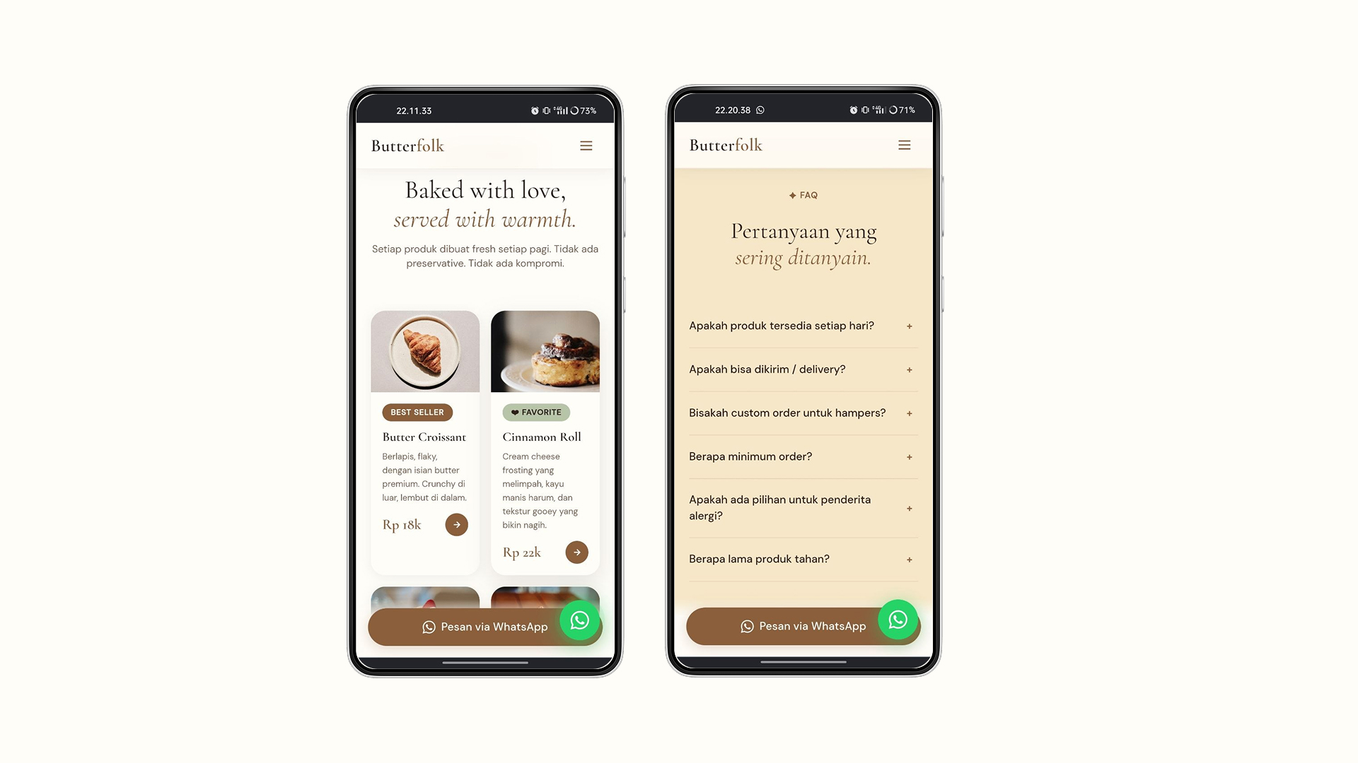
Responsive Showcase
every screen.
Every design choice reflects a deliberate strategy — reducing friction, elevating perception, and building the emotional connection that transforms first-time visitors into loyal regulars.
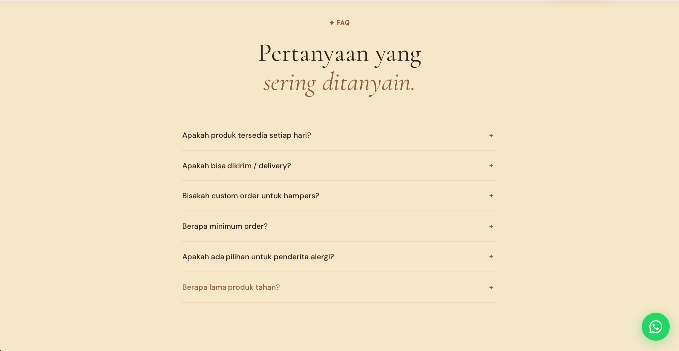
We stripped the nav to its essentials — Menu, Story, Order. Three anchors, no distractions. Visitors arrive and immediately understand where they are and what to do next.
The earthy palette was calibrated to evoke warmth before a single word is read. Cream backgrounds lower the heart rate. Walnut accents signal craft and quality.
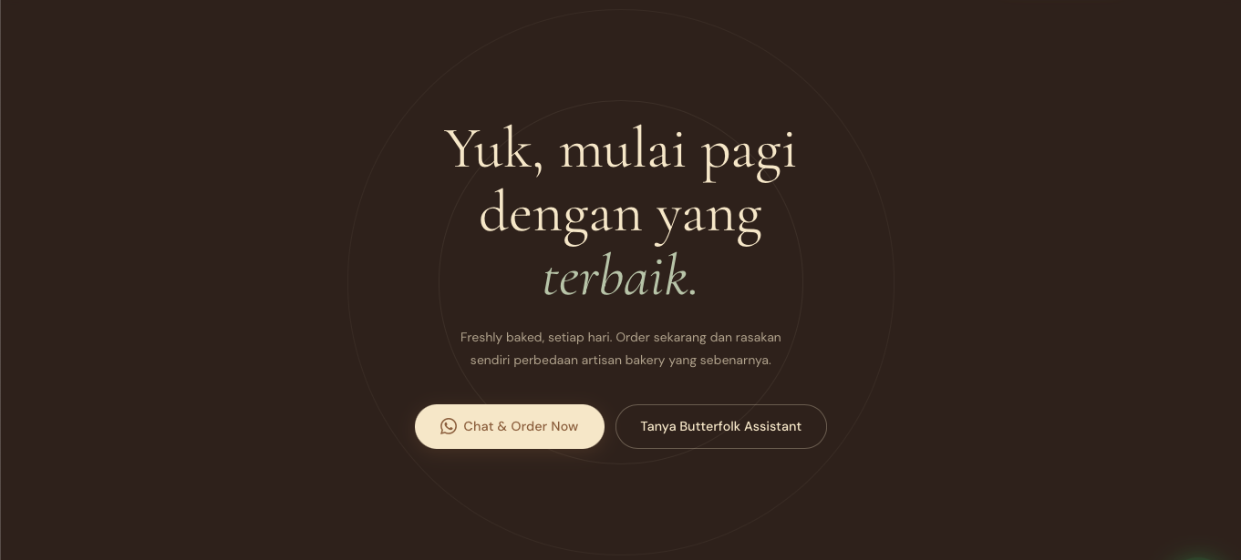
Rather than scattering calls-to-action, we placed a single, confident "Order" prompt at the natural emotional peak — after the brand story, when desire is highest.
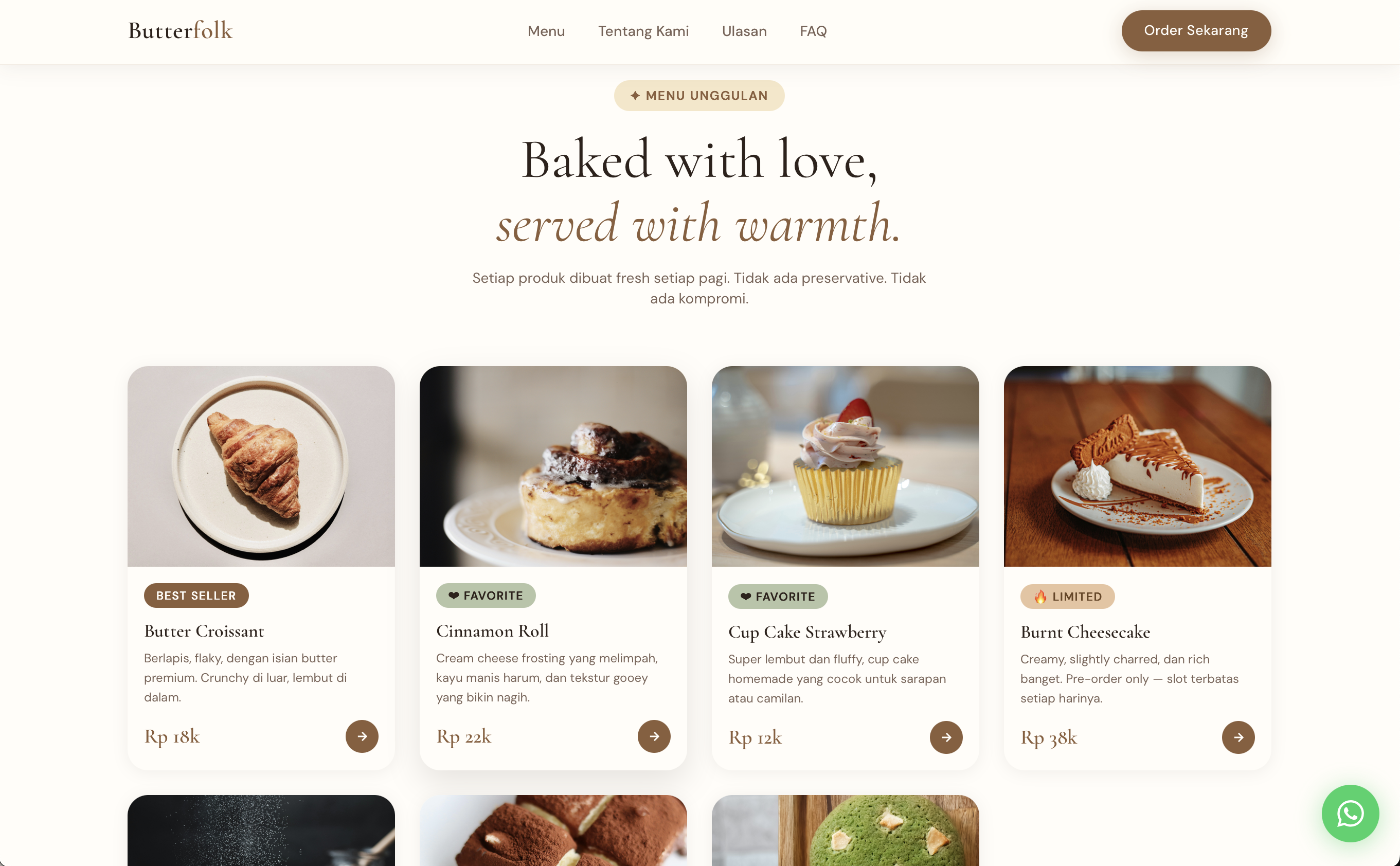
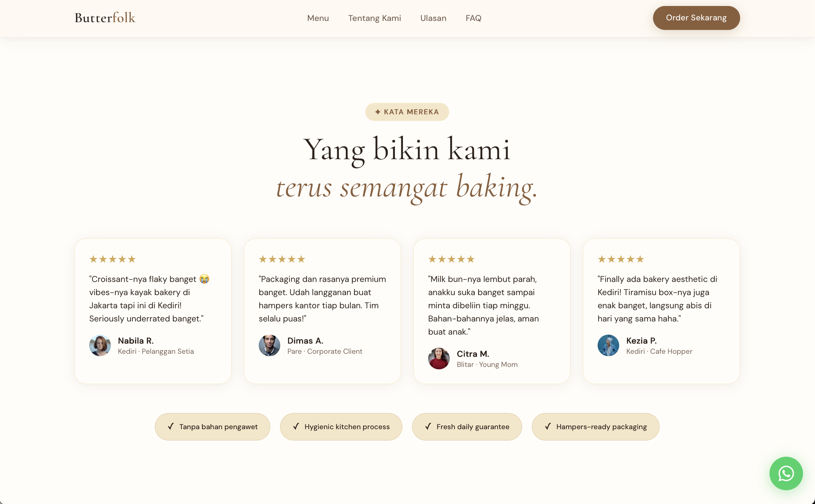
Inspired by print — asymmetric grids, generous white space, and oversized pull quotes. The page breathes. Users linger because the layout rewards attention.
Cormorant Garamond carries the soul of the brand — its italics feel handwritten, its weight feels considered. Paired with the airy neutrality of DM Sans, the system creates a voice that is warm and wise, approachable and premium. Typography doesn't just communicate — it is the brand.
Final Outcome
Butterfolk launched with a brand presence that matched the quality of what comes out of its ovens. A stronger identity, a warmer first impression, and a digital experience that earns trust at every scroll.
The result isn't just a website — it's a reflection of craft, care, and a bakery that knows exactly who it is.
Increase in mobile session duration following the redesign launch
Growth in online pre-orders within the first 60 days
Brand perception shift — customers now describe Butterfolk as "elevated" and "trustworthy"
Responsive across all devices, from 320px mobile to widescreen desktop
Start a Project
Great brands aren't built by accident. They're shaped by careful decisions, honest craft, and a clear point of view. Let's make something worth remembering.